
The Meaning of the Colour Pink
Introduction
Pink is a very light red, and is often colloquially called magenta, which on the RGB colour theory wheel is positioned between red and blue and opposite of green. Magenta makes up one of the primary colours of the colour model CMYK (Cyan, Magenta, Yellow and Key colour, which in terms of printing means black). Pink is often considered a tint of red, meaning it’s a mix of red and white. Despite this, most tints of pink are slightly bluish and lie between red and magenta, which is a slightly more purple colour.
Pink as a name for the colour was first used in the late 17th century, and derives its name from the flowers pinks, in the genus Dianthus, the flowers in turn get their name from their frilled edges. The verb “to pink” dates from the 14th century and means “to decorate with a perforated or punched pattern”, possibly from German picken, “to peck”. The verb lives on today in pinking shears, the zig-zaggy scissors used in tailoring to prevent textiles from fraying. The colour, however, has been described in literature since ancient times. Roman poets called it “roseus”. The colour rose may also be used to describe a specific hue of pink. In many languages, the name for the colour is based on the name of the rose flower. Including Swedish, Norwegian, Spanish, Italian, French, Dutch and German, to name a few. In some languages like Finnish, Danish and Faroese, the colour is referred to as “light red”.
Pink is symbolically associated with charm, politeness, sensitivity, tenderness, sweetness, childhood, femininity and romance. This is in stark contrast to the associations of red. Today, pink is often seen as a symbol of femininity and feminist movements, though this is a fairly new association with the colour. Before the 20th century, pink was considered by most to be a masculine colour and was more common in men’s fashion than women's. Scholars have linked the feminisation of pink with the emergence of the Barbie doll in 1959, whose signature colour was pink. Modern ideas of pink as a colour reserved for young girls are relatively new.
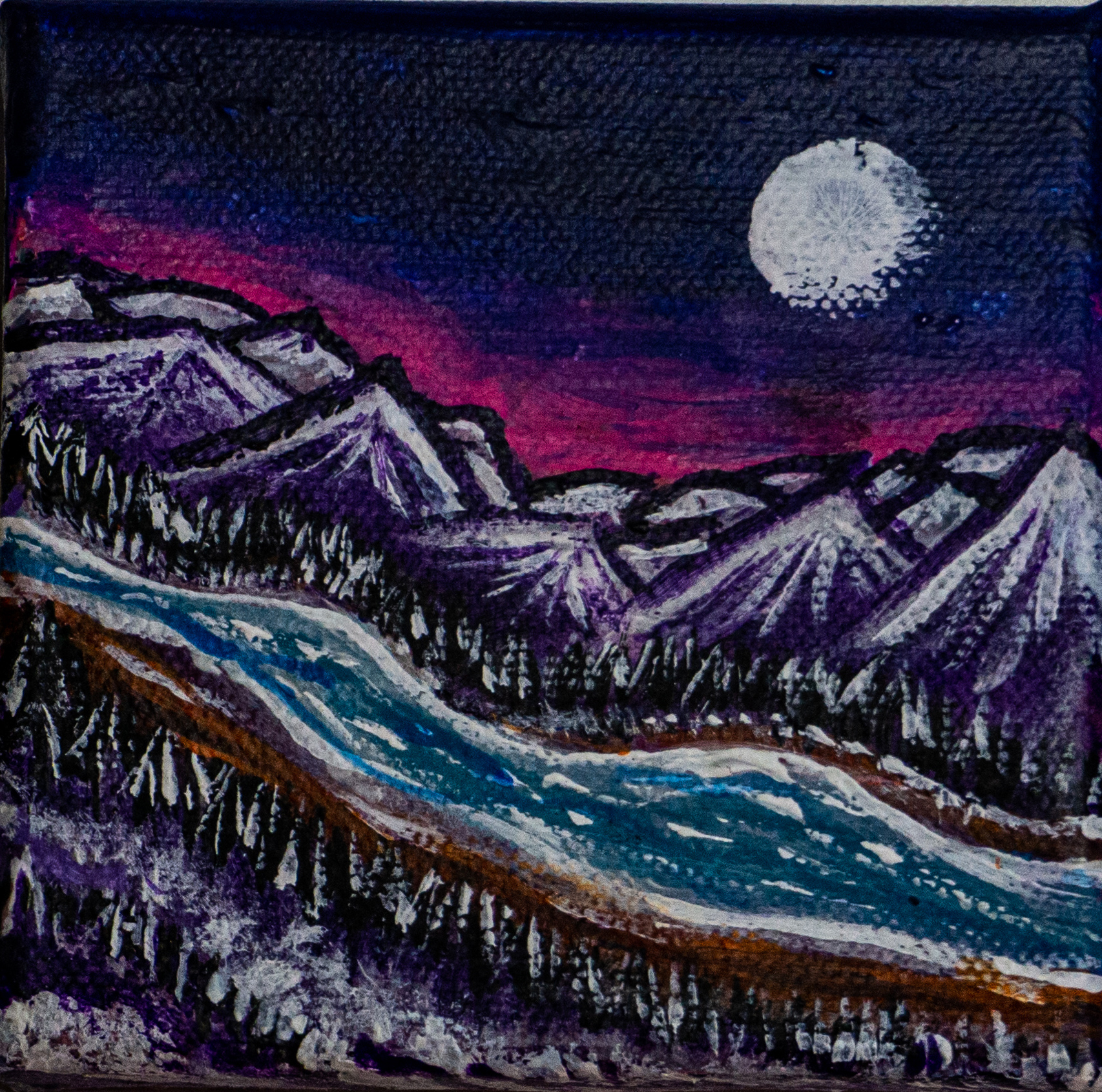
The colour appears in several instances of nature: in minerals like pink topaz and rose quartz, as well as in the afore-mentioned flowers and many other flowers, such as the picturesque cherry blossom. Pink is also a common colour of sunrises and sunsets, and that’s my personal strongest connection to the colour. In the great north where I grew up, pink skies are abundant, especially during winter and spring.
The colour, thus, is found frequently in my work, especially paired with cyan, to imitate those skies that sometimes express both colours eloquently and without much fuss. A colour combination that seems strange at first, but makes perfect sense when you see it. Perhaps inspired by those skies, sometimes you find old furniture and textiles in the north that combine both pink and a light blue. The colour pink hasn’t only fascinated and charmed people in the north; however, the colour also has a long history of use and meaning to people across the world.
In Culture
As mentioned previously, the colour pink has existed in cultures since ancient times, but as a dye, it was fairly uncommon, and red was often favoured over it. Even up until the Middle Ages, pink wasn’t a common colour in fashion. Crimson and other brighter reds were usually preferred by nobles. Notably, however, it did appear in some women’s fashion and religious art. In the 13th and 14th centuries, baby Jesus would sometimes be portrayed dressed in pink, and the colour came to be associated with the body of Christ. There exist English manuscripts with depictions of damsels dressed in pink dresses from around the same era.
Later, during the Renaissance. Pink was mostly used as a flesh colour. The pigment used was called light cinabrese, and was a mixture of the red earth pigment sinopia, or Venetian red, as well as a white pigment like lime white. Pink would become more popular with the upper class during the 18th century, when women like Madame de Pompadour, mistress of King Louis XV of France, championed the colour. The colour began being associated with romanticism and seduction in Europe and was worn by both women and men. There are many notable portraits from this time depicting both women and men wearing the colour, and the colour was used to symbolise romance and seduction, but also notably innocence, youth and tenderness. For example, in the portrait of Sarah Moulton, also known as “Pinkie”, by Sir Thomas Lawrence.
In the 19th century, in England, pink ribbons and decorations were often worn by young boys. The reasoning was that red was a colour worn by men, and pink was just a “smaller” hue of the colour, and thus fitting for “smaller” men. Almost all clothing for children during this time period was white, as before the industrialisation of chemical dyes, most colours would quickly fade when washed in hot water. So pink was found in some clothing, but was usually reserved for accessories or decorations that wouldn’t need to be frequently washed. The generally accepted rule was that “pink is for the boys, and blue is for the girls. The reason being that pink, being a more decided and stronger colour, is more suitable for the boy, while blue, which is more delicate and dainty, is prettier for the girl,” as an article in the trade publication Earnshaw’s Infants’ Department wrote in June, 1918. At the end of the 19th century, in France, Impressionist painters working with pastel colour palettes sometimes depicted women and children wearing the colour.
In the 20th century, the colour started becoming more vibrant and more associated with women. The process was gradual and through a selective process of the marketplace. In the 1920’s some groups still described pink as a masculine colour, and equivalent to red, and pink was still favoured for boys more often than men. However, by the 1940’s stores found that people were increasingly choosing to buy pink for girls, and blue for boys, until it became an accepted and established norm. Contributing to this was a multitude of events, including the 34th inauguration of the US president, Eisenhower, when his wife, Mamie Eisenhower, wore a pink dress as her inaugural gown. Her liking for the colour established it as a colour that “ladylike women wear”. As the colour gained an association with femininity, it would also come to gain a different association.
In 1940s Germany, inmates of Nazi concentration camps accused of homosexuality were forced to wear a pink triangle. A symbol which was later adopted by the modern gay rights movement. The pink of the 20th century was bolder, brighter and more assertive, largely thanks to chemical dyes, and the colour became a lot more popular and common. To this day, the political association of the colour lives on in modern feminism and gay rights movements. It remains a colour associated with traits that are commonly considered “feminine”, like compassion, love, sympathy, comfort, nurturing, romance, politeness, tenderness, softness and so on. However, across the globe, other cultures have perceived the colour differently, both contemporarily and historically.
In Japan, pink is still considered a more masculine colour but is commonly worn by both genders. It’s also associated with spring because of the blooming cherry trees. In most of the West, green is traditionally associated with spring. In Korea, it’s a colour symbolising trust. In China, pink wasn’t recognised as a colour for many years, and it only emerged into the culture due to increasing Western influences and in some Chinese languages, the colour translates simply to “foreign colour” according to some. My Chinese is 非常糟糕, and so I can’t verify this claim.
Pink has several symbolic associations, and studies conducted have shown that pink food is associated with sweetness. Candies and similar sweets are often dyed the colour for enhanced visual effect. It remains associated with childhood, sensitivity, tenderness and similar, but on the negative side of the colour, it’s often associated as an emotional colour, as well as timid, immature and unconfident. It’s clear that pink draws a lot of its association from the main colour red, but it’s often viewed as a “softer” or “watered down” red, having more shy and unsure qualities than the strong and brash qualities of red. It’s today, often considered a gendered colour, but historically, that hasn’t always been the case, and it remains a gender-neutral colour in some cultures.
I personally have more positive associations with the colour and typically don’t think of it as superficial or gendered, but rather as a natural colour. Mimicking flowers, skies and minerals.
In My Work
Pink has both a natural tone and an artificial one. We can associate it with flowers in green, or with bright neon signs in dark night skies. It has qualities of both red and white, and combines the two to make a pretty unique colour. It’s bright and signalling but not alarming. Its association with innocence and youth, but also seduction, brings to light some of the darker sides of humanity, and it’s a surprisingly complex colour, juxtaposing gender and more.
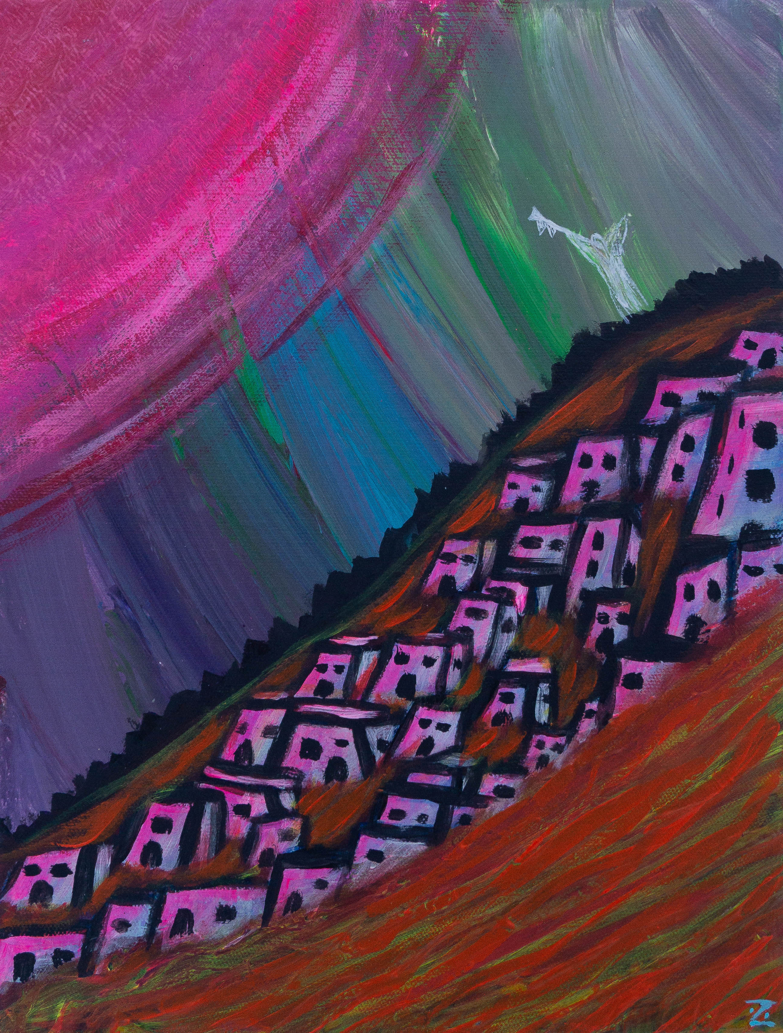
The painting V.A.L.I.S and Pompeii draws inspiration from the novel V.A.L.I.S by Philip K. Dick, the biblical story of Sodom and Gomorrah, as well as the city of Pompeii and its end. In the novel by Dick, the protagonist experiences visions of a pink beam of light, which he interprets as a theophany - an encounter with divinity. In the painting, the pink hues serve both as an adjunct to the fiery reds of a volcanic eruption, but also as this electric and sci-fi light of Dick’s writing. It’s a timid colour yet destructive, and it draws symbolic parallels to the destructive qualities of red.
As mentioned earlier, my most common association with pink is that of the skies where I grew up. The colour has continued to serve as an inspiration in my work, as such. It’s a gentle yet assertive colour, and it’s a beautiful colour, especially paired with darker colours.
I am particularly fond of pairing it with blues and moving it along those hues. Purple is between red and blue and pairs well with both. Dark colours really bring out the brighter qualities of the colour, and it’s often better matched than just plain red, which, especially paired with black, can make it a more menacing colour. Pink is friendlier in that way and really stands to shine when paired against a dark background.
It draws attention to something, just like red and yellow, but in a more vibrant way. It’s a playful yet serious colour and can be used in both contexts. It’s not a natural skin tone, unless it’s a caucasian that has been out in the sun for too long, but as an undertone to skin, it can really add life and warmth.
Pink as a colour is very versatile, and it can appear both warm and cold. A lot of its association and symbolism is tinted with paradox. It’s a colour of tender flesh, of vibrant neon, and it represents both the good and bad of things like emotion, tenderness and childhood. It’s typically associated with gender, but I find it to be quite limiting to the potential of the colour; to me, it’s neither a masculine nor a feminine colour.
It’s naturally occurring, but also now so chemically associated that it’s often viewed as artificial. It’s a bold colour, but also timid. It has many versatile sides and is especially beautiful when seen in the sky. With nothing else to say, I will leave you with a last piece of pink trivia:
The famous pink bird flamingo, is pink because of the pigment in the shrimp they live off. Flamingoes are, in fact, grey.