
The Meaning of the Colour Orange
Introduction
Orange is the colour between yellow and red on the visible light spectrum. In traditional colour theory, it’s a secondary colour made by mixing red and yellow. Now for the reveal you’re here for: Which came first - the colour or the fruit? The answer is that the colour gets its name from the fruit, and in many languages, even though the concept of the colour existed before these cultures were exposed to the fruit, they had different names for it. An example is Swedish, where orange was called “brandgul”, meaning “fire-yellow”, but these days the more common name for the colour is the anglicised “orange”. In Swedish and other Germanic languages, the fruit is called “Apelsin” or a variation of it, being a mix of “apel/apple” and “Sina/Kina” meaning China, translating roughly to Chinese Apple.
The English word ‘orange’ itself has a long and convoluted etymological history relating to the fruit. The word ‘orange’ comes from Old French for the fruit ‘pomme d’orange’, which in turn can be traced to the Italian word arancia, whose roots go back to Arabic, eventually Persian and from there continues all the way back to Sanskrit and the Dravidian root word “naranja” referring to bitter orange in Tamil and Malayalam. Before the word was introduced in English, the colour was often described as red, e.g “red hair” and “redhead” who in reality have a hair colour closer to orange than actual red. Other names included yellow-red, tawny or brusk.
Orange is evocative of fire and autumn, and symbolically associated with amusement, unventionality, extroversion, warmth, energy, activity, taste and aroma, linking it to the sweetness of the citrus fruit from whence it gets its name. It’s an important colour in Asia, where it’s abundant in both Buddhism and Hinduism, and saffron was used early on to dye clothing orange. It’s generally considered an uplifting colour, and combines the passion of red with the positivity of yellow to create a striking colour. Some more negative aspects of orange can make it a dominating, superficial and exhibitionistic colour, drawing from the negatives of both red and yellow.
In my own work, I like to use it to paint fiery skies and frenetic movement. It’s a warm colour that immediately brings to mind the cosiness of autumn leaves and a warming fire on a cold winter’s day. Personally, I find orange to be more positive than both yellow and red, and it brings out the best qualities of both colours. Just like red, it immediately draws attention to detail in art, but in a less intrusive way than red. There are lots of orange foods, and it’s a naturally abundant colour. Pumpkins, carrots, apricots, mangoes and many more are all orange foods, and because of this, orange might be the colour most commonly associated with aroma and taste.
As a colour, orange has a long and rich history across the world in many different cultures. Ranging back to ancient Egypt and India, and spanning all the way into the modern world, where it remains a staple of several countries’ flags, including Ireland, India and Armenia, to name a few. Despite being missing from their flag, it is the national colour of the Netherlands, where the royal family, the House of Orange-Nassau, derives its name in part from the principality of Orange in South-Eastern France.
In Culture
In ancient Egypt and India, artists used orange as a colour early on for a variety of paintwork. Ranging from wall paintings to clothing, the most common source of early orange pigments was a variety of reddish minerals. The mineral orpiment was a source of both orange and yellow pigments in ancient Rome and was important to Roman trade. The mineral was also used in ancient China as medicine, despite its containing arsenic and being highly toxic. The mineral was also a favourite of medieval alchemists who were searching for a way to make gold.
Orange fruit trees were first brought into Europe from Asia around the late 15th and early 16th century, but the colour existed before then, and as discussed, it often went under a different name. Most commonly, some variation of ‘yellow-red’. It was first around the 17th century, when the fruit was well established in Europe and the fruit was able to be imported freshly into England, that the linguistic shift began to take place and orange became an adjective and the modern understanding of the word was established. The Dutch royal House of Orange, previously mentioned, were one of the most influential families in Europe between the 16th and 17th centuries, and their legacy would spread the colour across the world.
The colour would become strongly associated with Protestantism when the House of Orange joined the Protestant side in the French Wars of Religion, and furthermore, when William III of Orange became King of England in 1689, after the downfall of the Catholic king James II. Because of William III, orange became a political colour in Britain and Europe. William was a Protestant, and as such, he defended the Protestant minority of Ireland against the Roman Catholic population; because of this, Protestants in Ireland were often called Orangemen. The colour eventually became one of the main colours of the Irish flag, serving as a reminder of the Protestant heritage of the country.
Dutch settlers also brought the colour with them to their colonies in Africa, where an orange stripe adorned the flag of the independent Boer republic Orange Free State (Oranje Vrijstaat) and then later the flag of South Africa for a while. In the US, the New York City flag has an orange stripe to symbolise the Dutch colonists who founded the city.
With the invention of the heated greenhouse in Europe in the 17th century, the orange fruit became more and more common, even in northern Europe; these greenhouses would commonly be called orangeries. By the turn of the century, French scientist Louis Vauquelin discovered the mineral crocoite, which led to the synthetic pigment chrome orange. This and other advancements, like the metal paint tube, made it possible for artists of the time to bring the paint outdoors, giving rise to more natural sceneries, and so began an obsession with the colours of natural light.
In England, the Pre-Raphaelites began using the colour extensively, painting realistic scenes with a focus on history. Festive scenes of Romans wearing orange togas, likely brighter than any the Romans actually wore. The palettes of painters at the time brightened with vivid oranges. In France, around the same time, painters took the colour in a different direction. Claude Monet named one of his paintings Impression, Sunrise, which details a hazy blue waterscape with a bright, small orange sun above. The title of the painting gave its name to the entire Impressionist movement.
This made orange an important colour for all Impressionists. According to books on colour theory at the time, orange was placed next to azure blue and the two colours were believed to make each other brighter. Toulouse-Lautrec viewed the colour as particularly festive and amusing and often used it in the skirts of dancers and gowns of Parisians in the cafés and clubs he painted. The colour remained popular with the post-impressionists, and painters like Van Gogh and Paul Gauguin used orange for backgrounds, clothing and even skin colour.
Today, orange is mostly used for its high visibility, just like yellow. Lifevests are commonly orange for their visibility, as well as clothing worn by roadworkers. It’s also like red and yellow, commonly used as a warning of possible danger or as a call to caution. It continues to be a political and religious symbol for protestants and remains an important colour to Buddhists and Hindus who commonly wear orange robes.
In Buddhism, orange (or saffron as it’s more commonly referred to in Asia) is the colour of illumination and the highest state of perfection. The colour of the robes worn by monks was defined by the Buddhist texts, where they serve as a symbol for renunciation of the outside world and a commitment to the Buddhist order. According to Buddhist scriptures and commentaries, the robe dye is only allowed to be derived from six substances: roots and tubers, plants, bark, leaves, flowers and fruits.
In Europe and America, both orange and yellow are associated with amusement and entertainment. The complete opposite of its complementary colour, blue, which is the colour of calm and reflection. Clowns commonly wear orange wigs, and mythological paintings depicting Bacchus (Dionysus in Greek myth) wearing a robe of orange.
Orange is a colour symbolic of energy, amusement, deep spiritual commitment and much more. It remains a culturally significant colour, and serves as both a warning but also as a welcoming colour. It’s associated with foods and the festivity of autumn.
In My Work
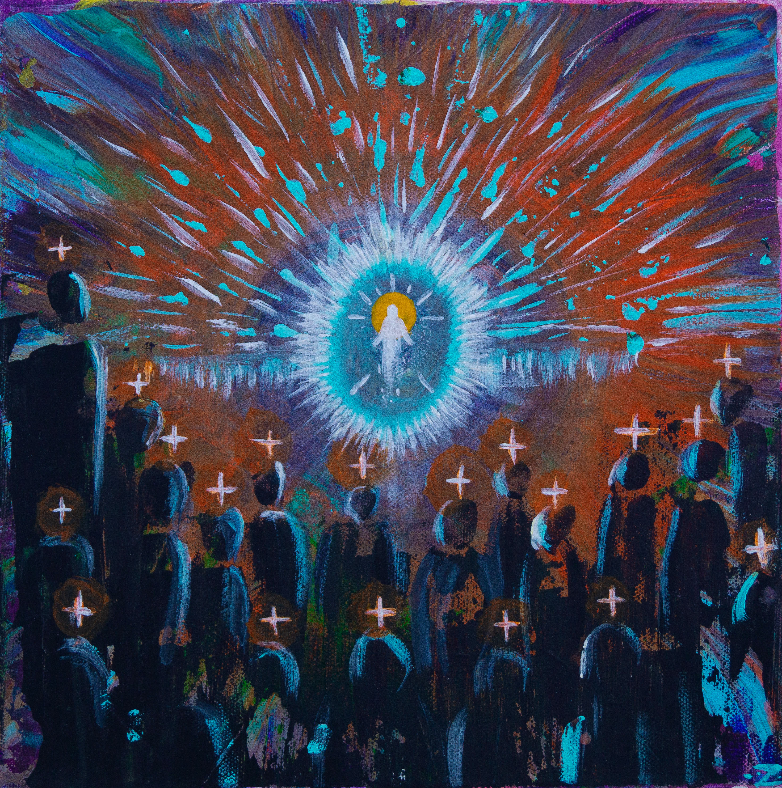
Orange’s fiery energy, paired with the subtler qualities of yellow, makes it an extraordinary colour. It’s more than calm confidence, and it’s more humble than self-assured red. It’s a lovely colour, invoking a plethora of feelings in a piece, and one that is not uncommon in my Work. Its symbolism is often evocative of the qualities of fire, but also light and serves as a spiritual symbol of both.
It’s an optimistic colour, telling us to approach life with joy and optimism, and the power of those qualities. Creativity isn’t just art, it applies to many aspects of life, and it’s important to remain optimistic in mind, thought and spirit. It’s a colour that carries a lot of spiritual weight in different belief systems, and most, if not all, of them are of positive connotations to the practitioners.
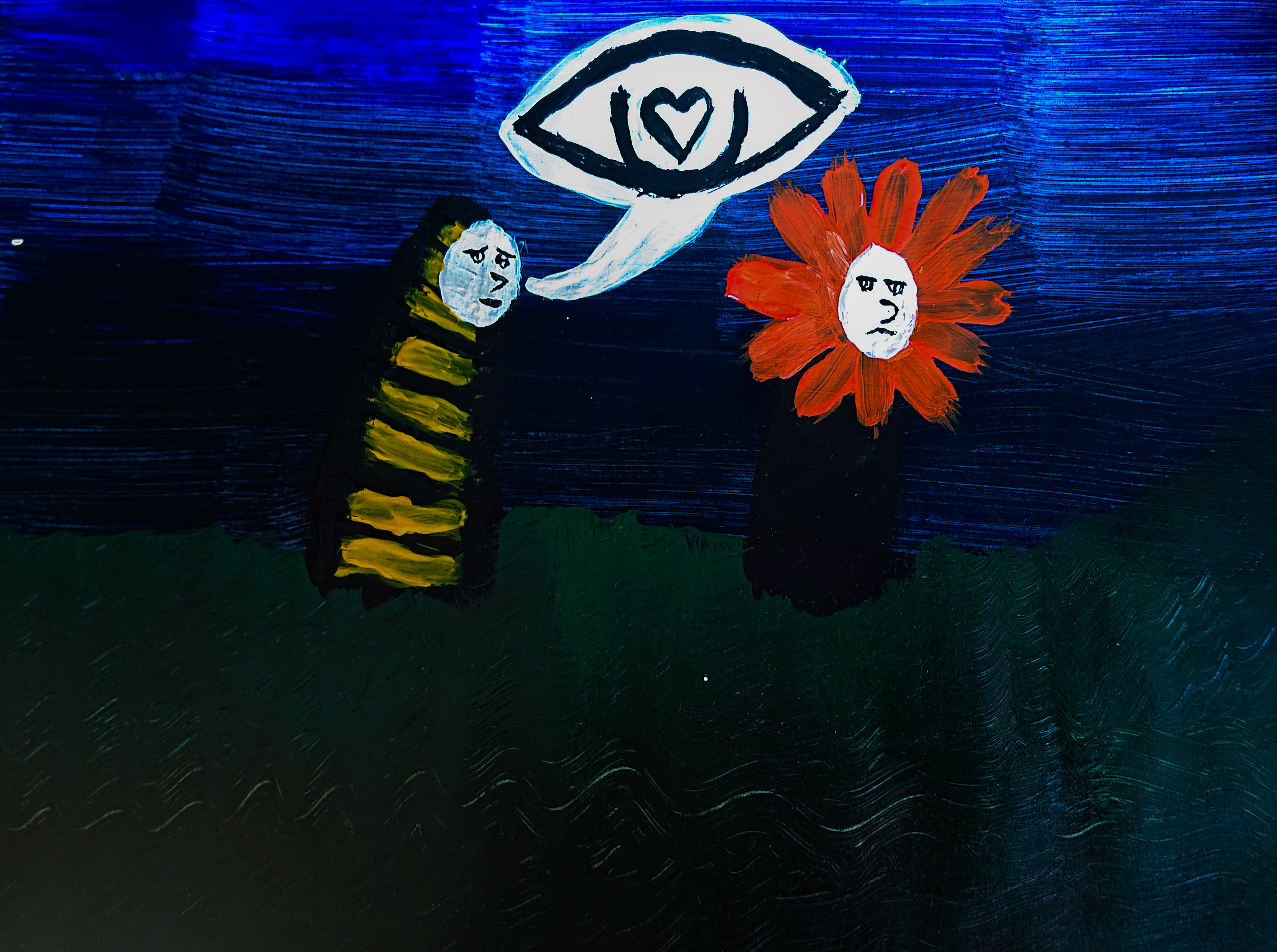
Orange is abundant in nature and is found in foods, plants, animals and much more, and while painting floral arrangements isn’t my artistic strong suit, there are a lot of very beautiful orange flowers. In an early work of mine, I wanted to explore the theme of unrequited love, something I think most people experience at some point in their life. It might seem a simple thing at the time for some - "I like this person more than they like me", but with hindsight you realise that's not always the case. Sometimes we think we're bees chasing people we think are flowers, but people are truly neither.
The scene is dark and filled with deep blues and greens, as well as black, and it needed a striking colour to really bring home the point. The muted yellow of the bee still isn't as strong as the oranges of the flower, and it's a wonderful colour to not only add more light to a scene, but also to highlight something of importance. The theme might be a little melancholic, but I wanted the scene to be a little more lighthearted, and orange is a great colour to bring a little unconventional joy to something otherwise serious, without being completely silly.
I think orange goes really well with the green and especially with cyan. Perhaps it’s a combination of colours you don’t find a lot in nature, and it makes it somewhat surreal or fantastical. The two colours seem to amplify one another, and it’s a combination of two mixed colours that seem to play very well together in my eyes.
I don’t strictly follow any set of colour theory, and don’t care much for it personally. I see what I like and don’t like and create from that point. It can be challenging at times, and orange is one of those colours that I don’t particularly care for but almost always like. Truthfully, I haven’t reflected much on it before, and therefore writing here about it is a little difficult; nonetheless, it’s a worthwhile pursuit to reflect and contemplate what colours mean to us and what they do in our work.
I appreciate orange and its qualities a little bit more now.